A History Of Grand Theft Auto Box Art, From GTA 1 To GTA 6
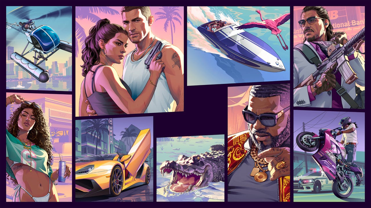
Rockstar Games has revealed the official cover art for Grand Theft Auto 6, which launches on November 19 and will open pre-orders soon. The cover continues a design tradition the franchise has maintained for nearly three decades, featuring a collage of characters and iconic elements from the game.
The history of GTA box art reveals a dramatic evolution in the series’ visual identity. The original Grand Theft Auto and GTA 2 featured realistic photography mixed with flashy titles designed to grab attention, reflecting the games’ 2D, top-down perspective. Notably, GTA 2 is the only game in the entire franchise to actually depict the titular crime—a grand theft auto—showing a carjacking in progress on its cover.
The franchise underwent a significant shift with Grand Theft Auto 3, which marked the series’ transition to 3D and established the character-focused collage aesthetic that has dominated GTA covers ever since. This approach showcases recognizable characters and game elements rather than realistic imagery, becoming the template subsequent games have followed.
Rockstar’s design consistency has been occasionally criticized for being formulaic. GTA Advance was particularly criticized for lazy artwork—simply featuring the series logo on a gray background. While digital distribution has diminished the importance of physical box art, critics note that cover designs still communicate a developer’s creative vision.
The GTA 6 cover follows this established collage format, mixing characters like Lucia and Jason with typical GTA elements including vehicles, characters, and an alligator. Some observers have described the design as “oddly muted and lacking in personality” compared to more stylized entries in the franchise’s history, continuing the debate about whether visual consistency serves the brand or stifles creativity.
Sources
- A History Of Grand Theft Auto Box Art, From GTA 1 To GTA 6
- Nearly 30 Years Later, Only One GTA Cover Actually Shows The Titular Crime
- The Evolution of Grand Theft Auto’s Iconic Cover Art, Now Including GTA 6
- After GTA 6’s cover reveal, we ranked every GTA box art
- Rockstar’s GTA 6 box art tells us nothing and is distinctly lacking in personality