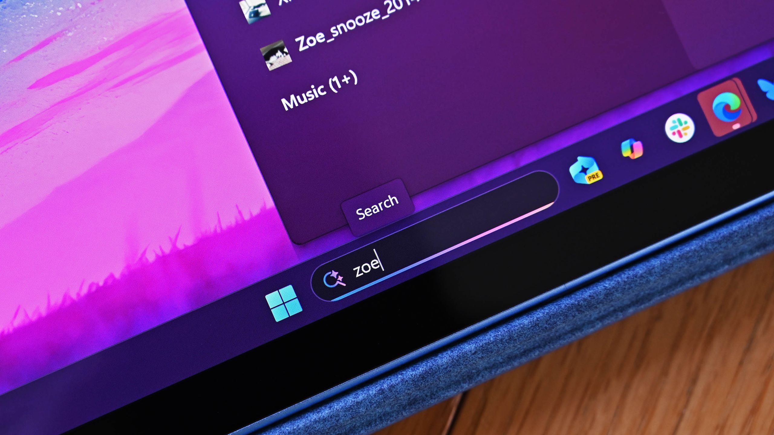
Windows 11’s smallest upgrade shows a big commitment from Microsoft
Microsoft is increasing the height of the Windows 11 Start menu search box by four pixels in an upcoming preview build, marking a small but deliberate step toward addressing longstanding design inconsistencies across the operating system.
The change, which was accidentally revealed in preview build release notes, initially became the subject of mockery online—the relatively minor nature of the adjustment seemed trivial at first glance. However, it demonstrates Microsoft’s broader commitment to systematically improving the Windows 11 user interface and creating visual coherence across the platform.
The minor search box adjustment is symptomatic of a larger issue that has plagued Windows 11 since launch: scattered design inconsistencies throughout the operating system. Context menus and other interface elements have not received consistent visual treatment, creating a disjointed user experience. By incrementally updating these elements—even in small four-pixel increments—Microsoft is signaling that design refinement remains a priority despite the updates’ subtle nature.
The incident underscores how software development and incremental improvement often involve unglamorous, granular changes that accumulate into more polished products. What appears insignificant in isolation—a marginally taller search box—represents part of a larger strategy to modernize Windows 11’s visual language and deliver a more cohesive interface to its billions of users worldwide.