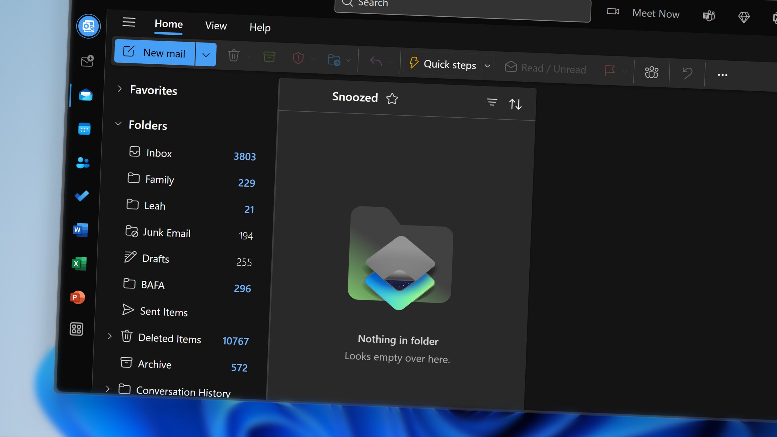
Microsoft accidentally admits new Outlook looks bad
Microsoft is introducing an optional theme setting for the new Outlook that recreates the appearance of classic Outlook, available in both Outlook on the web and the new Outlook for Windows. According to Microsoft, the feature is designed to assist users transitioning from the classic version to the updated client. However, the move has prompted criticism that the gap in visual design between the two versions is significant enough to warrant a cosmetic workaround, suggesting potential quality concerns with the new interface. The decision to offer a classic-themed alternative raises questions about whether Microsoft adequately addressed user experience expectations in the new Outlook’s visual redesign. The option appears to acknowledge that the departure from the familiar classic interface may be jarring for long-time users, despite the company’s efforts to modernize the email client.